October 10, 2026


Most UX case studies read like a project diary. The screens arrive in the order they were made, a method section follows, and by the end you still cannot tell what the designer decided or whether it worked. Readers — usually a design lead with twelve tabs open — are not short of work to look at. They are short of evidence that you think clearly when the answer is not obvious. A template helps because it decides what earns a place on the page.
The strongest case studies open with the sharpest thing you did. Three or four sentences: the product, the problem, what you changed, what happened. A reader who stops after paragraph one should still know your contribution. Write this part last, once the rest of the page is finished, and keep it free of adjectives. “We redesigned the checkout and abandonment at the address step fell by about a quarter” beats “a delightful, seamless checkout experience” every time. If your opening reads like a press release, cut it back until it sounds like you explaining the work to a colleague.
This outline works for a student portfolio and a senior one. The difference is depth, not structure.
Six lines, no more. Keep it in a small list so it can be skimmed in ten seconds:
Explain the world the work had to survive in: the business goal, the user problem, and the limits — a legacy system, a legal review, a fixed release date, a small budget. Constraints are what make your decisions worth reading, because they explain why the obvious answer was not available to you.
Replace “users found the form confusing” with something answerable: “How do we let a first-time buyer compare tariffs without reading a table of numbers?” A sharp question tells the reader what you were solving and gives you a test for the rest of the page. If a section does not help answer it, that section is probably not needed.
Say where your work stopped. “I ran the interviews and the interaction design; a colleague owned the visual system; two engineers built the prototype.” Precision builds more trust than a paragraph of first-person plural. If you worked in a team, show the seam.
This is the heart of the case study, and it is usually the shortest section in a weak one. Choose two or three moments where the path forked — a navigation pattern, a flow order, a wording choice, a scope cut. For each, cover four things:
Methods belong here only when they changed your mind. A paragraph on affinity mapping earns its place if the map revealed the real problem; otherwise it is admin dressed as craft.
Numbers if you have them, honest description if you do not. Usability-test completion rates, support tickets on a theme that went quiet, time on task, a decision a stakeholder finally made, a successful launch — all count. If the data is missing, say what you would measure next time. Do not dress a hunch up as a metric, because a sharp reader will spot it and discount the rest of the page.
Two or three sentences on what you would do differently, specific enough to act on. “I would have tested the pricing step with five people before the build” is useful. “I learned the value of user research” is not.
Cutting is where most portfolios improve fastest. Remove anything that proves effort rather than judgement:
A user quote with the context around it. A before-and-after with a number attached. An annotated screen that marks the one decision you want noticed. A short note explaining that a feature was cut for legal reasons, or that the design shipped at eighty per cent and what you would fix next. If a project sits under a confidentiality agreement, describe the shape of the problem and your approach without naming the client or showing the screens. Reviewers understand that; vagueness is what they distrust.
Aim for roughly 800 to 1,200 words per case study, plus images and captions. If you have three strong projects and four weak ones, publish three. Put the one closest to the job you want first, because plenty of readers will never reach the bottom of the page. Use headings that say something — “Cutting the address step” beats “Design process”. Keep paragraphs short, and make every caption carry information rather than just labelling the image.
Ask someone outside design to read the page and tell you, in one sentence, what you decided. If they cannot, the decisions are buried somewhere in the middle. Read your summary aloud; if it sounds like marketing, rewrite it. Check each claim you make about results, and either soften it or attach the evidence. Then handle the small things: consistent tense, UK spellings, useful alt text, and a clear next step at the end — a contact address, a CV, or the next case study. A case study is a working document, not a monument. Revise it after your next project and it will keep getting sharper.
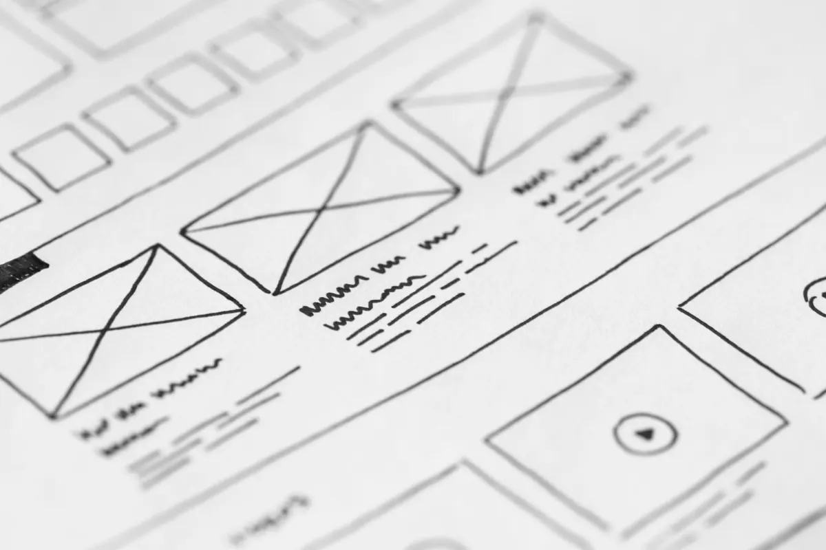
Photo: picjumbo.com / Pexels

Curated portfolios for creative professionals.
Copyright © 2026 Ideal Folio. All rights reserved. Ideal Folio.